Motileo changelog
Bar Chart Widget for Dashboards
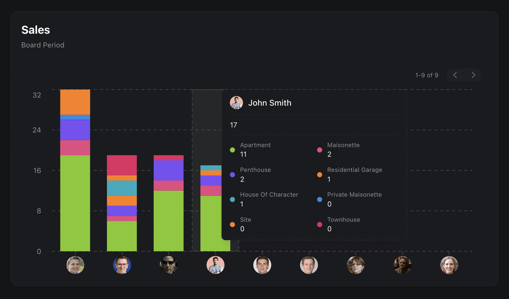
We’ve introduced the Bar Charts widget. A powerful new way to visualise and break down your team’s performance directly within your dashboards.
Go beyond surface-level metrics and explore your data with flexible grouping options. You can now organise your charts by user, team, department, or any custom field that matters to your business. Want deeper insights? Stack each bar with additional layers of detail. For example, view performance by team and instantly see individual contributions within each bar.
This added dimension makes it easier than ever to understand what’s really driving results. Whether you're analysing calls by user and breaking them down by status, or comparing performance across departments, the Bar Charts widget helps you uncover patterns, identify opportunities, and take action faster.
More clarity. Better insights. Smarter decisions. All in one view.